An early adopter of Magento 2, OneStepCheckout and Hyvä
Online Spy Shop is a leading retailer of surveillance equipment (cameras, audio, security etc…) featured in a 2017 eCommerce Nation article on how to create a killer niche and win using Magento 2.
Being an early adopter of OneStepCheckout for Magento 2, we also documented their best practices in a case study which we updated in early 2021 to show the improvement they made to their website, not just at checkout but from the homepage further down the online sales funnel through to product pages and cart.
Later the same year they launched a new version of their website that uses Hyvä themes, brilliantly executed by Foundation Commerce Magento Agency to further boost the website’s findability and browsing experience. Here’s a summary of the key changes and insights driving those for your inspiration.
Get more traffic
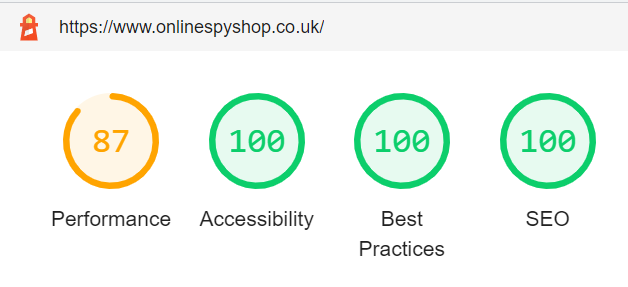
This is the whole point of using Hyvä Themes: improve your Core Web Vitals, get more visibility by ranking higher in Search Engine Result Pages (SERP) and allow a better, safer, and faster browsing experience for any visitor who lands on your website.
Look at the Google Lighthouse scores hit by OnlineSpyShop! 🏆
- 100% with Accessibility
- 100% Best Practices
- 100% SEO
Optimize your homepage real estate to drive “add to cart” conversion
Once you’ve done all the right things to get people on your homepage, you want them to buy.
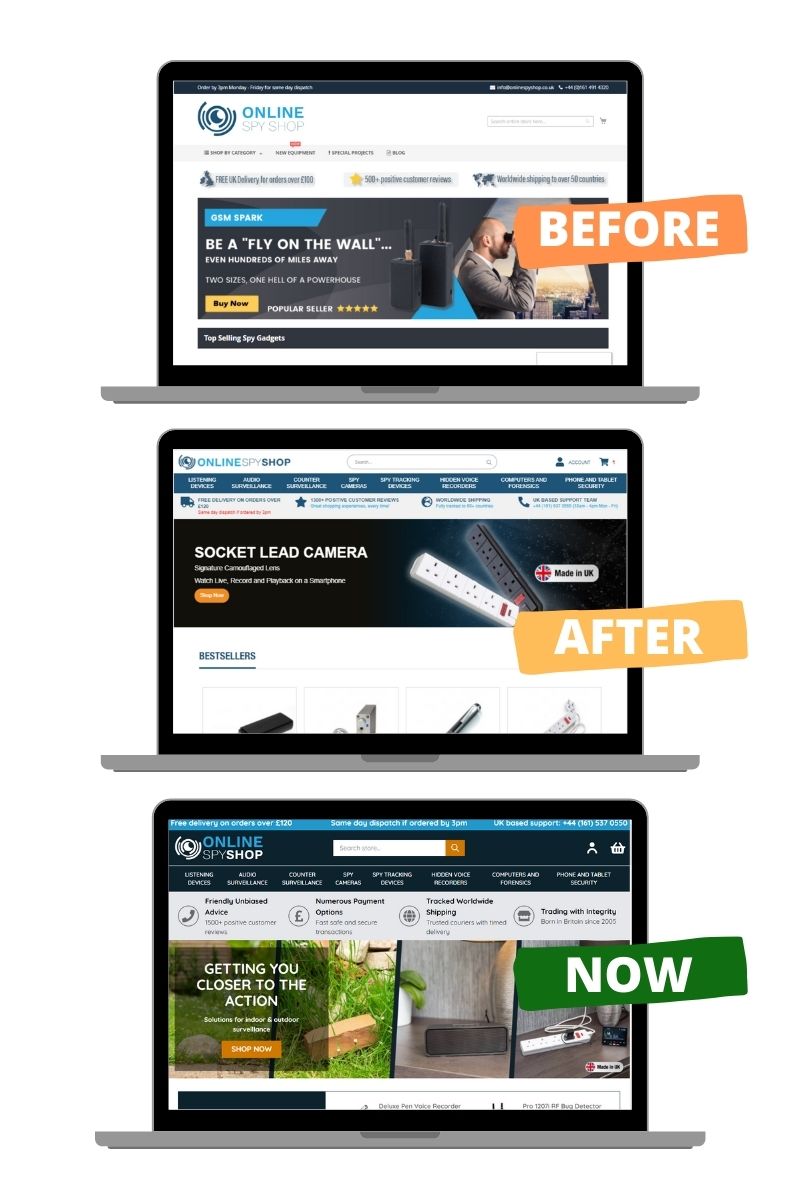
Is your logo taking way too much real estate?
With consumers’ attention span reducing to just a few seconds, you need to cram as much information as you can in that rectangle above the fold. Even though the younger generation is used to scrolling, the target audience for surveillance equipment purchases is more likely to be older, shop on laptops and desktops either for their homes or their own businesses.
Looking at the evolution of the online store’s homepage design, here are the key takeaways that you can consider and apply to your own website.
Differentiate from your competition by building more trust
With increasing competition and more retailers going online, the need to stand out and drive trust is critical.
Trust happens at many levels as customers are anxious about:
- your company: who are you, is your business legit? How can you be contacted if customers need advice on what product to choose or after-sales service?
- your products: what quality standards do you offer?
- their parcel: how quickly can they get the items they need, how do they keep track
- their financial details: how safely can they pay on your website
Online Spy Shop did a great job here to use an insight around consumers’ preference to shop locally with businesses based on their home countries and products made locally.
Additional transparency is provided by highlighting:
- customers reviews
- dispatch time and delivery fees, which is reiterated on to product pages too.
Show width and breadth of your product assortment
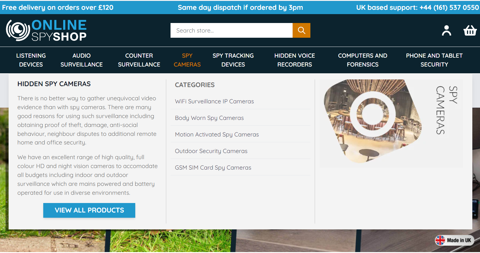
In the new designs, the logo size was reduced and the business was able to:
- show the range of products using the top navigation bar
- add a mega menu that shows the depths of the product assortment as well as expertise through additional content
- show and quick links to best-selling products higher above the fold
Drive those clicks to Product Pages
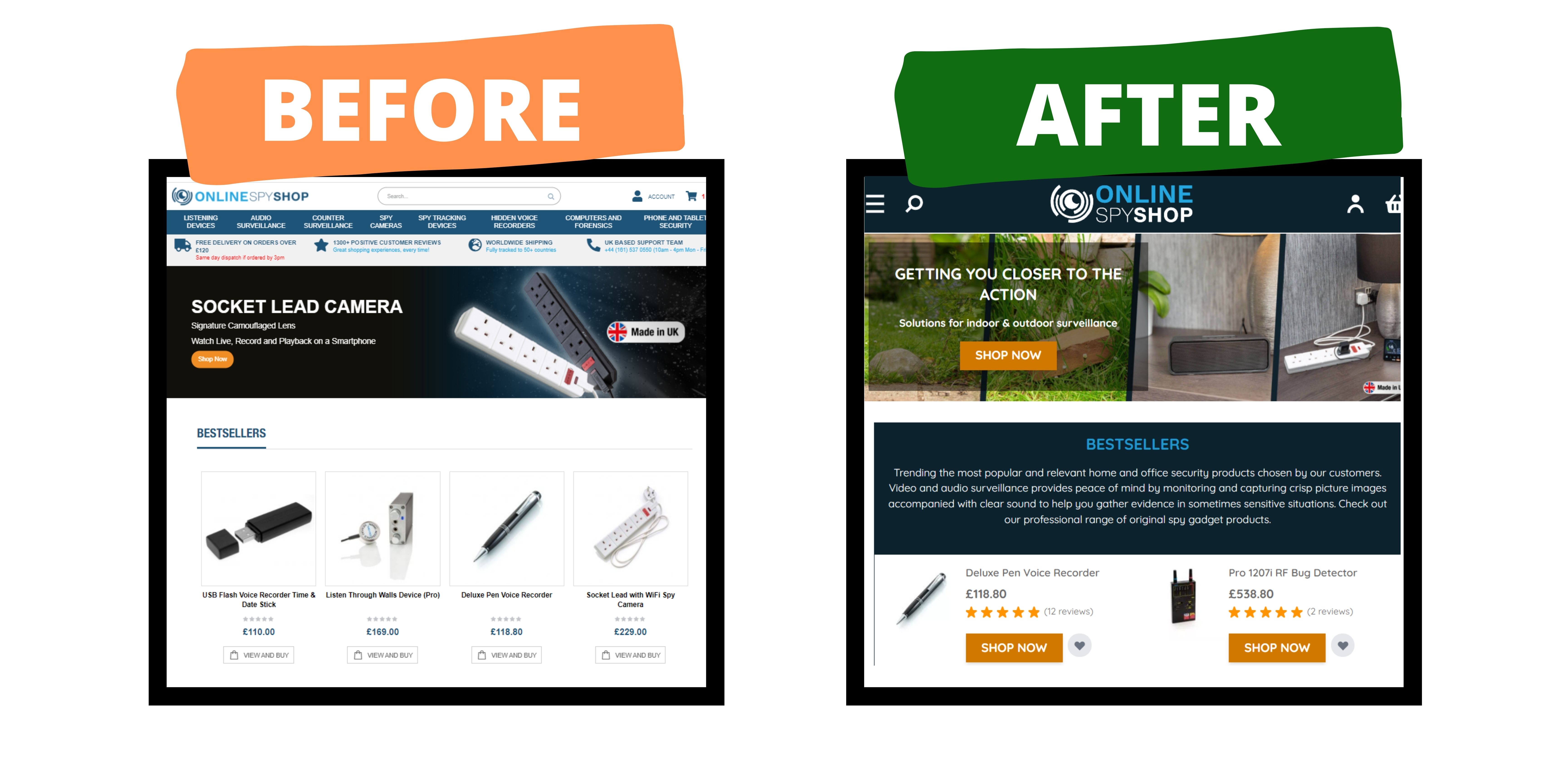
Interestingly, if you look at the new homepage vs the previous version below, you will see that:
- fewer products are shown per row
- content is added to break out the various “collection” further down the page
- “Shop now” buttons and star ratings are much more prominently displayed with the use of contrasting colors.
Maximize your Checkout Conversion
See all the efforts you made to get potential customers to land on your website, click on a product and decide to buy a product? What if we tell you that out of 10 filled baskets, 7 will be abandoned and only 3 will go through to checkout completion and payment?
According to studies and surveys that have been carried out for over 10 years, the top reasons for cart abandonment are:
- When customers feel they are forced to create an account
- When customers don’t see the order total calculated upfront
- When there are too many pages and fields to fill out to complete checkout
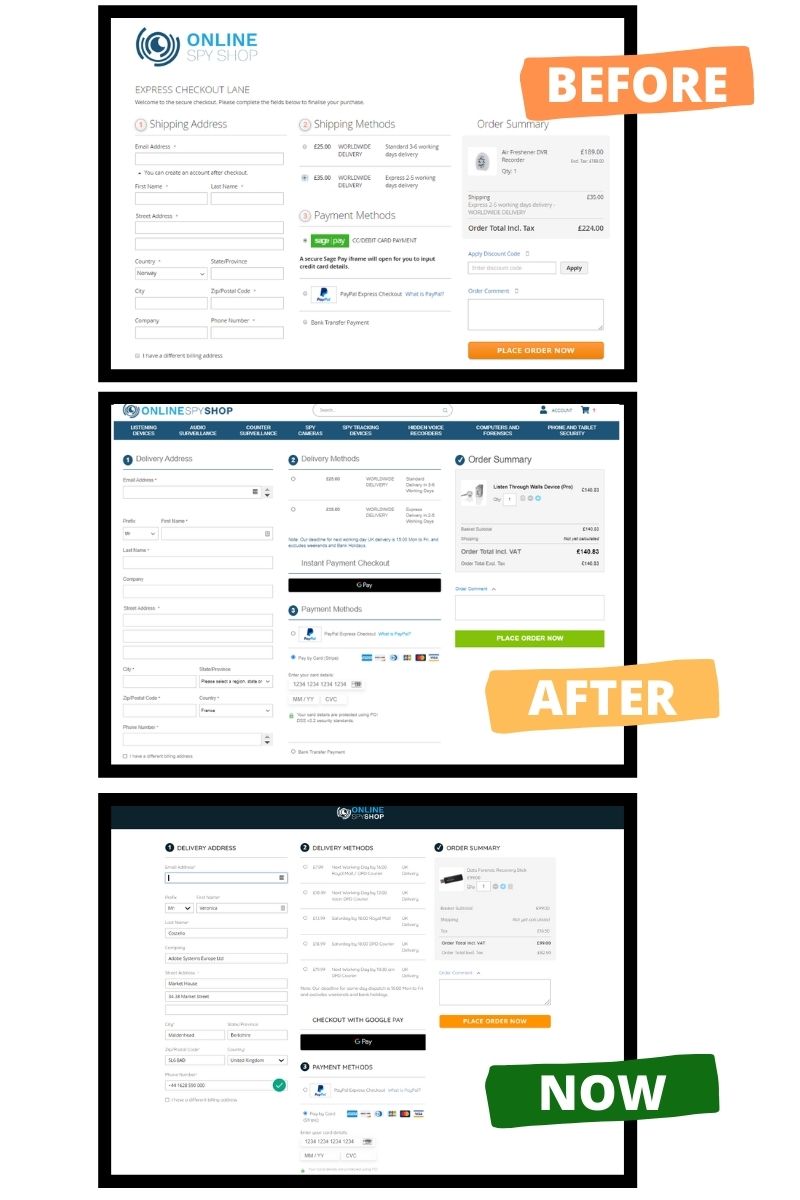
To address those barriers, Online Spy Shop chose to use OneStepCheckout for Magento 2 right from the start, so that they could shape their Magento 2 checkout page the way they wanted and the way it converts better. Here are the tactics they implemented:
Remove friction
It’s proven, each additional field that a shopper has to fill decreases its chance of completing checkout. As such Online Spy Shop put everything in place to prepopulate order details as much as possible while minimizing typos and therefore lost parcels.
Functionalities you can see in their current checkout include:
- email, address and phone number validation thanks to Loqate (formerly known as PCA Predict)
- address lookup and autofill when entering a postcode
- Google Pay and PayPal Express Checkout are offered as a way to even skip the shipping address and payment details input steps
- No registration or login required. They can automatically create accounts after checkouts and link orders to existing customers when relevant. Read more about Registration Modes.
Remove distraction
What we can clearly see in the various iterations of the checkout design is that the business made sure customers are focused on completing checkout and not tempted to click away from this page i.e.:
- the navigation bar with all the product categories and search bar have been removed
- the login and cart icons on the top right have also been removed
- the coupon code field has been removed
- Sage Pay is replaced by Stripe so that customers stay on the same page to pay
Meet your customers’ needs and expectations
Customers now expect fast, cost-effective shipping and free returns. For small businesses, it is not always possible to absorb the cost. One strategy is to make it super transparent for shoppers to arbitrage between fast and cheap delivery methods and provide various options that they can choose from.
In this case, Online Spy Shop has improved its checkout over the years to offer:
- choice of many shipping options including next day by 12, or even Saturdays through DPD Courier or Royal Mail
- choice of many payment options including Google Pay, PayPal Express Checkout, Credit Card (via Stripe), Bank Transfer
Go one step further
- onlinespyshop.co.uk live store
- OneStepCheckout for Magento 2 DEMO
- Online Spy Shop case study by Foundation Commerce
- Reasons for cart abandonment and how to fix your Magento 2 checkout
- More about Hyvä Themes and the value they bring to Magento 2 merchants and Agencies
- Conversation with a merchant using Hyvä and OneStepCheckout
